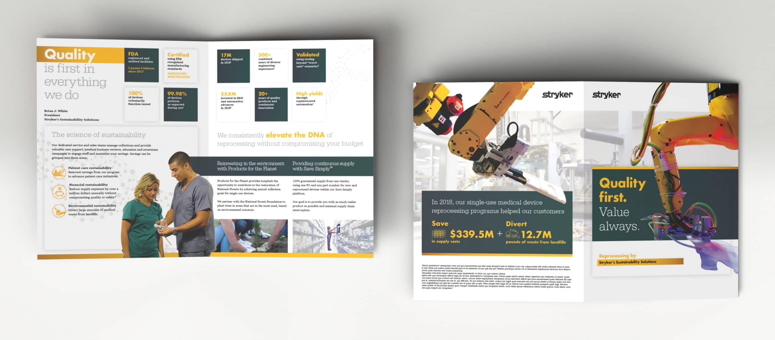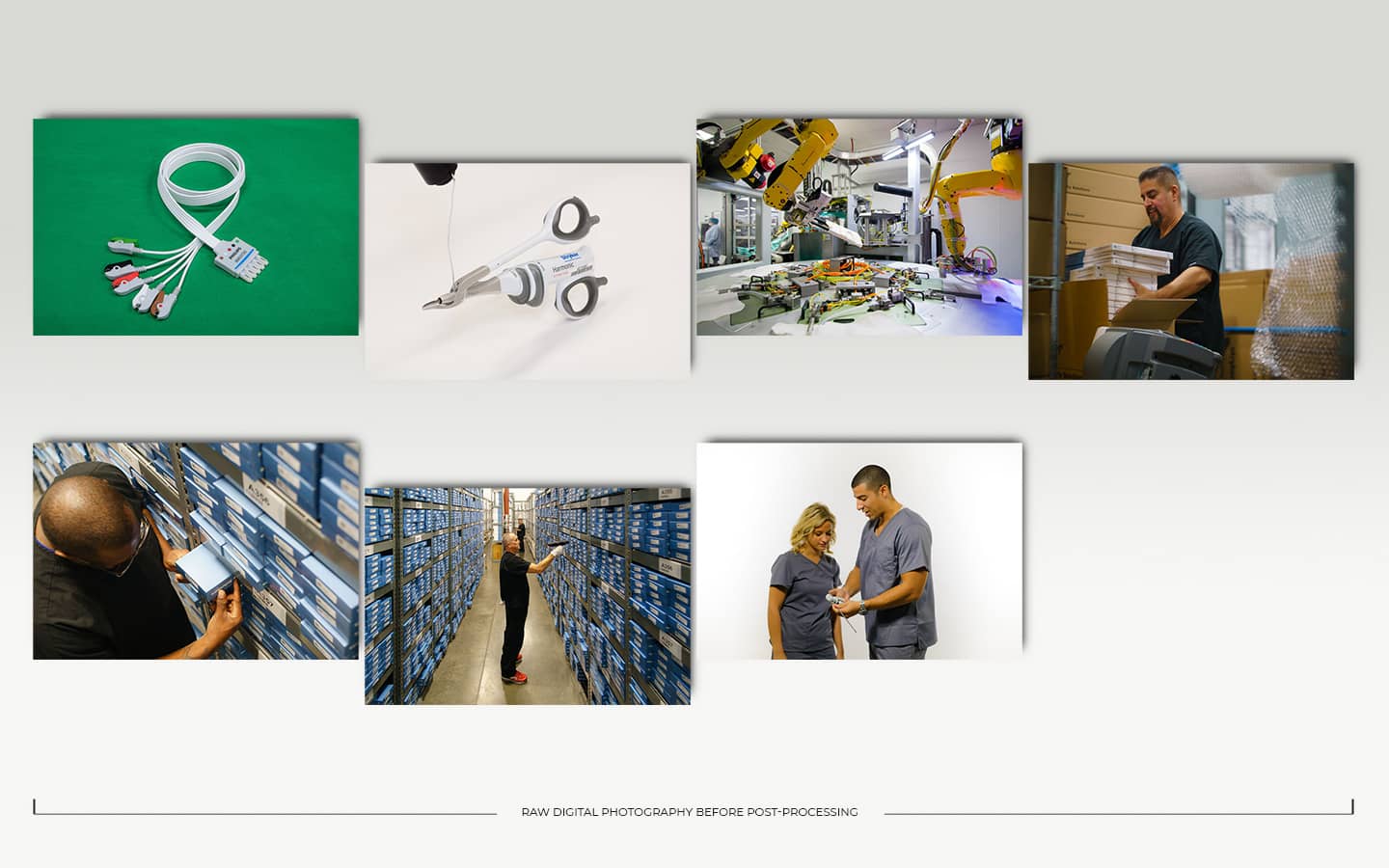
The corporate brochure is a very useful tool to provide a broad overview of your business. They often require a lot of effort and an upfront strategy about what you’ll accomplish. The strategy of this brochure was to take the market research we had and transform it into a customer-friendly piece that broke down the sophistication of medical device reprocessing. Our quality systems messaging needed to have the highest priority. Then, there was a need to breakdown our differentiators in the marketplace. Both featured a large cover graphic that was cutout from the background, layered, and printed with a high-gloss spot UV. This because nothing speaks louder than images sometimes, especially those that remove human error and inadequacies from the equation like automated robotics. Our first iteration missed the mark slightly on the inside and focused a little too much on our service and how reprocessing works. However, the second version was more of a foray into what it means to have an excellent quality system. Satiable nuggets were provided that gave metrics, historical numbers, and trends to support the claim. Our service and reprocessing messaging was combined into one logical chunk and specific programs were also spotlighted in a secondary tier. This second effort proved itself much better than the first. The brochure was extremely well-received by customers and internal staff alike.


