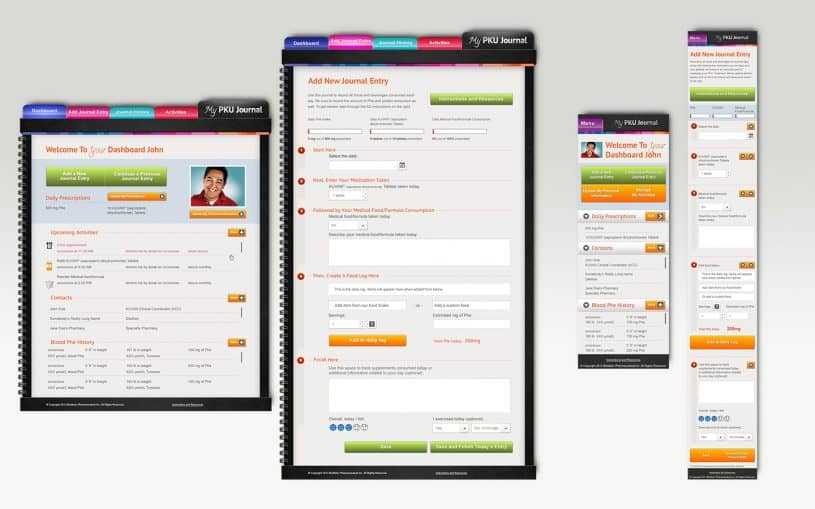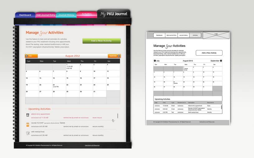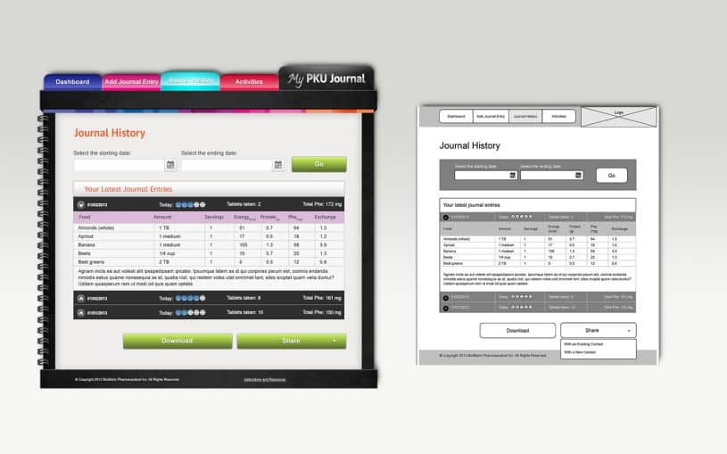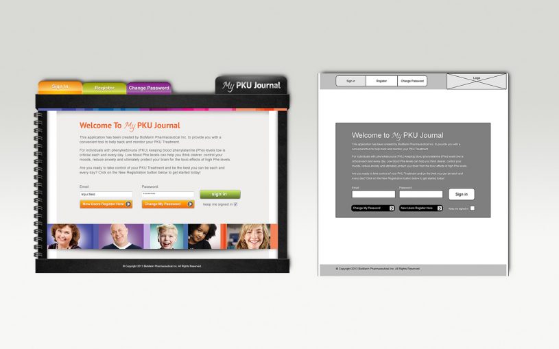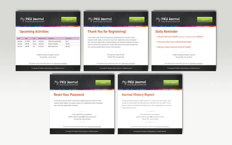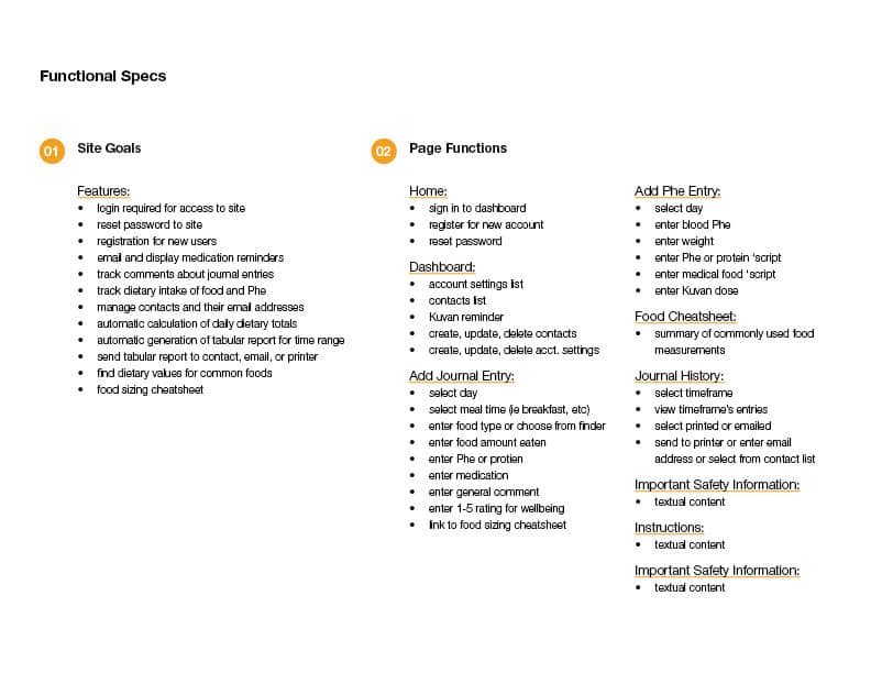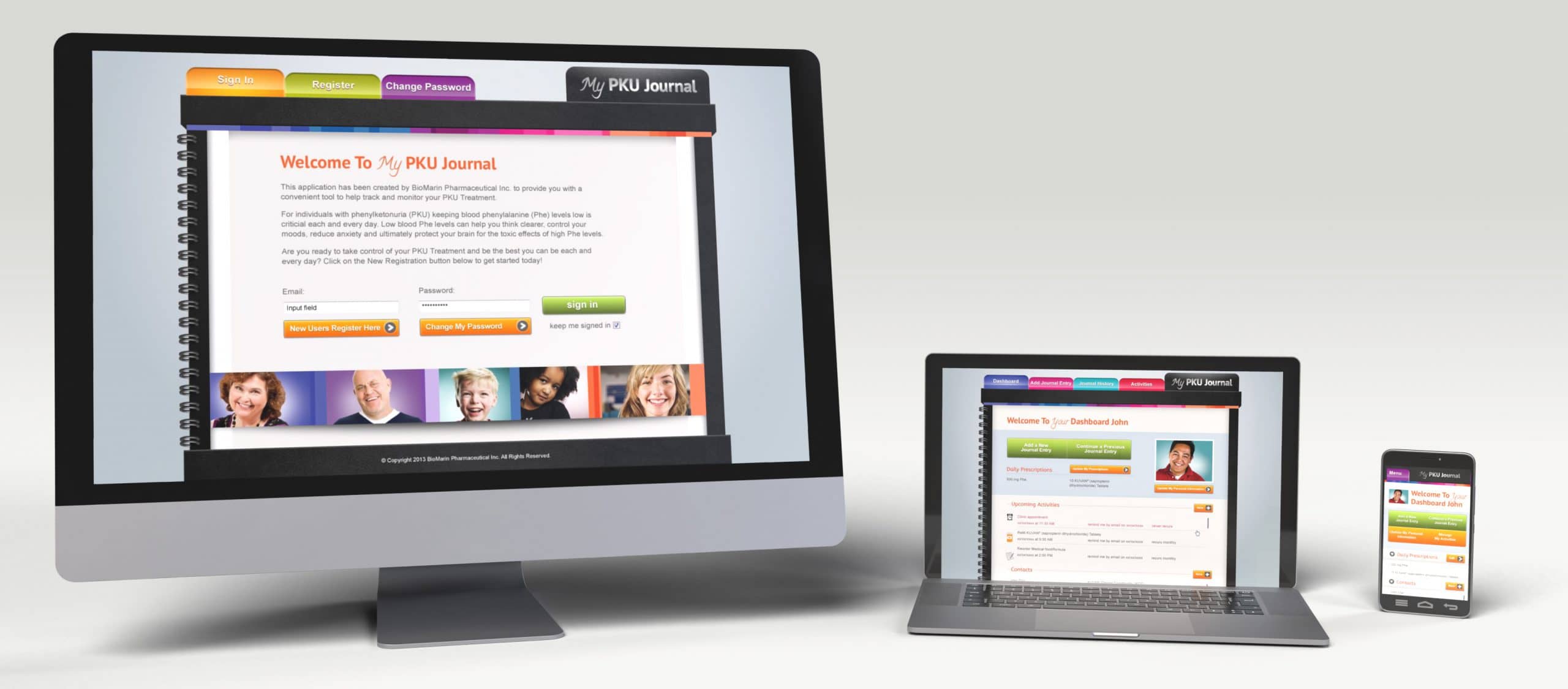
Skeuomorphic design inherits its aesthetic from the tangible object it most closely resembles, or its original. This project was to be a skeuomorphic journal application that tracked an individuals journey with Phenylketonuria. It managed contacts, events, prescriptions, blood chemistry, and journal food log entries. The app required the full valet of design services in order to ensure the success of the project. The information architecture for the site alone required a three point approach: sitemap, wireframes, and flowcharts. Once these were established and approved, the design was much easier to advance through. Oftentimes the information architecture phase is worth the spend alone to mitigate indecision or misunderstanding during later project stages. As an added benefit it’s quicker to iterate there anyhow. Email designs were then added to the package and the whole thing was wrapped up and ready for development kickoff.
