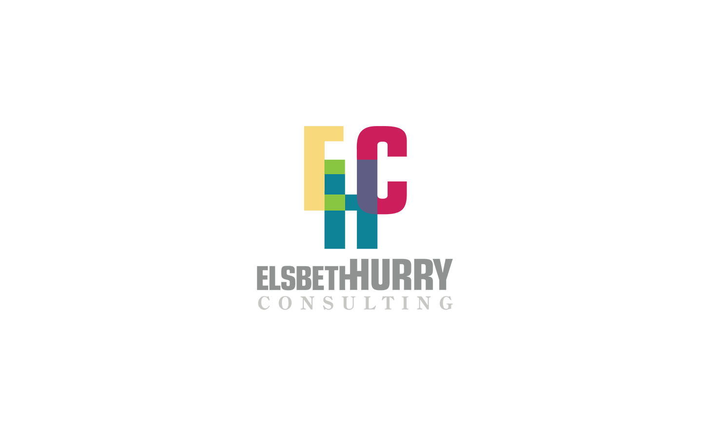
Designing a logo for a coaching and advisory consultant can be a challenging creative project. In this case, the logo needed to be formal, bold, and androgynous enough to encapsulate a large audience. Likewise, the logo needed to symbolize the traits of the audience: it should express passion, drive, and success. We felt the concepts that were given correctly captured these themes.
The clever use of design ornaments ultimately convey contextual meaning and make a logo good or bad. Stressing these elements is integral. In these concepts, there are many ornaments that were used.
- The use of large bold sans-serif typeface allowed the concepts to feel strong and meaningful.
- A script typeface was selected that felt devoid of gender.
- The use of lines and implied lines creatively spoke to being elevated or rising up and above; Platforms of achievement.
- Letter forms were blended together forming steps to further this impression.
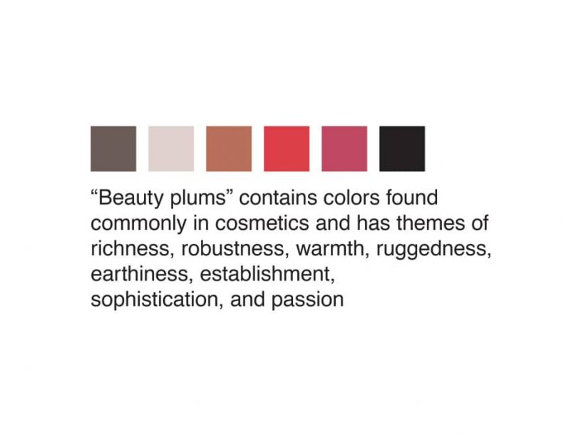
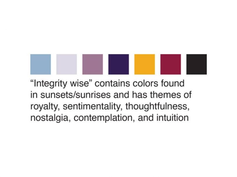
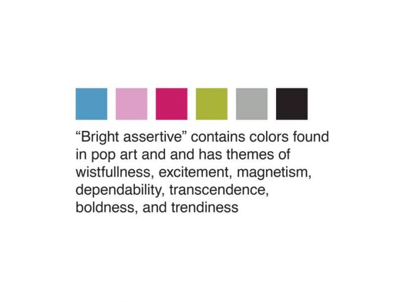
- Color psychology was used to pick the palette that conveyed something bright, bold, sentimental, and wise.
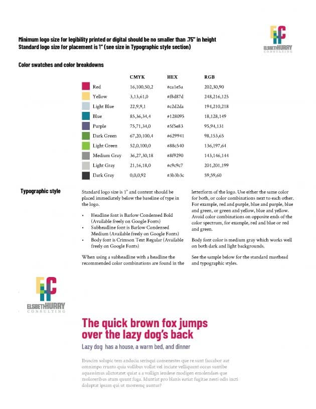
When the client chose the winning form, a brief brand guideline was put together in the form of a succinct one-page summary to aid in the aesthetic use of the brand. In the end, the client was extremely happy with the process and the final version.
