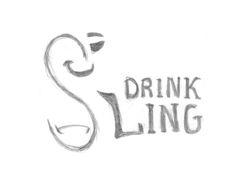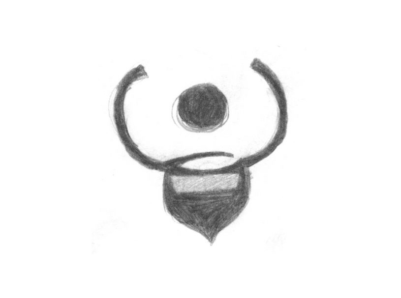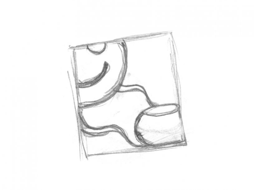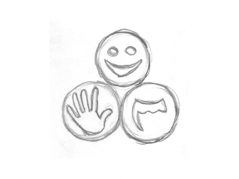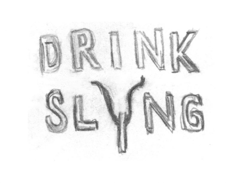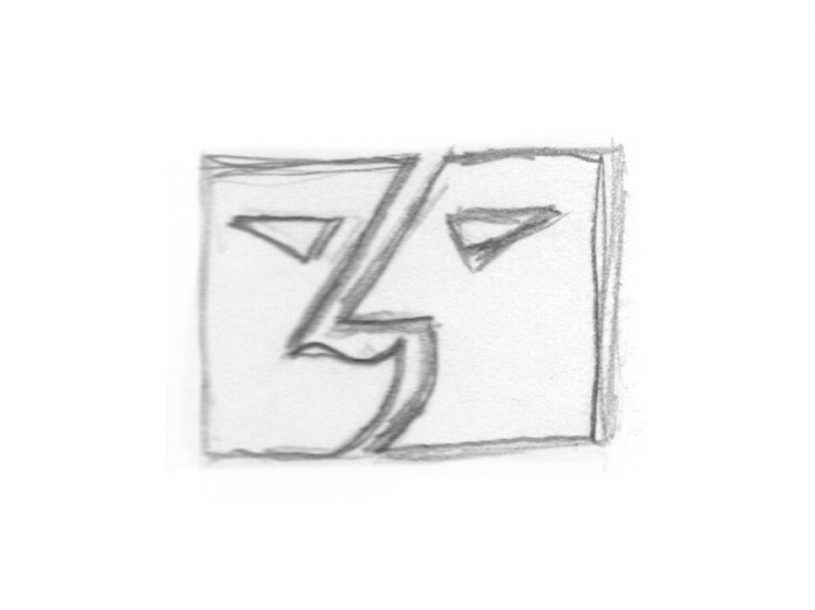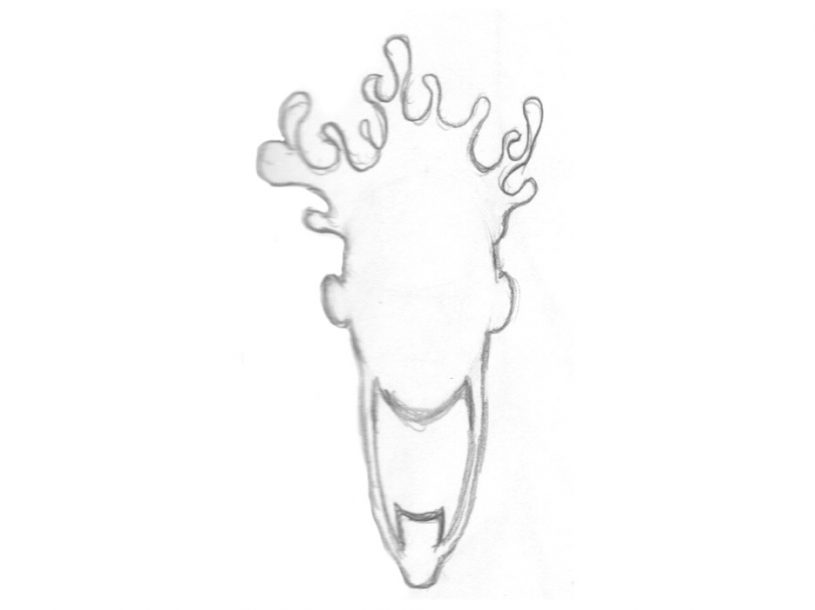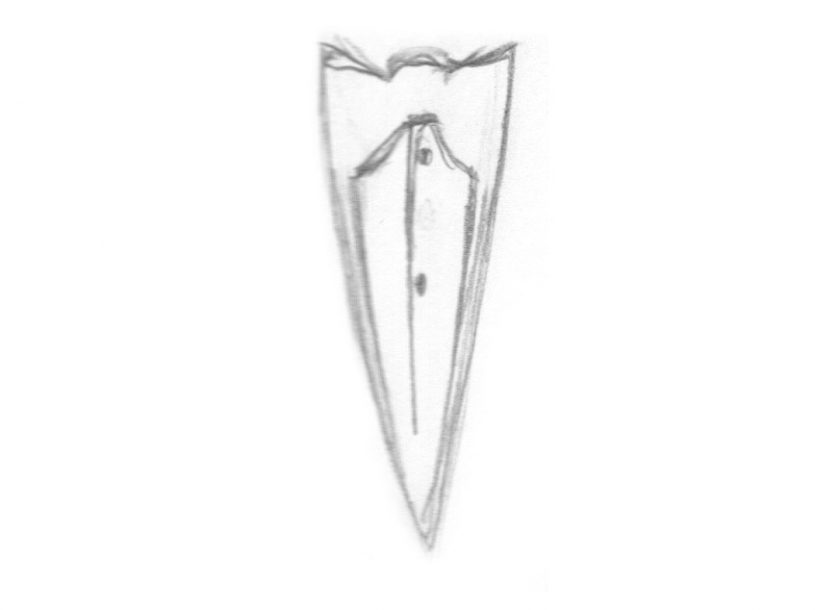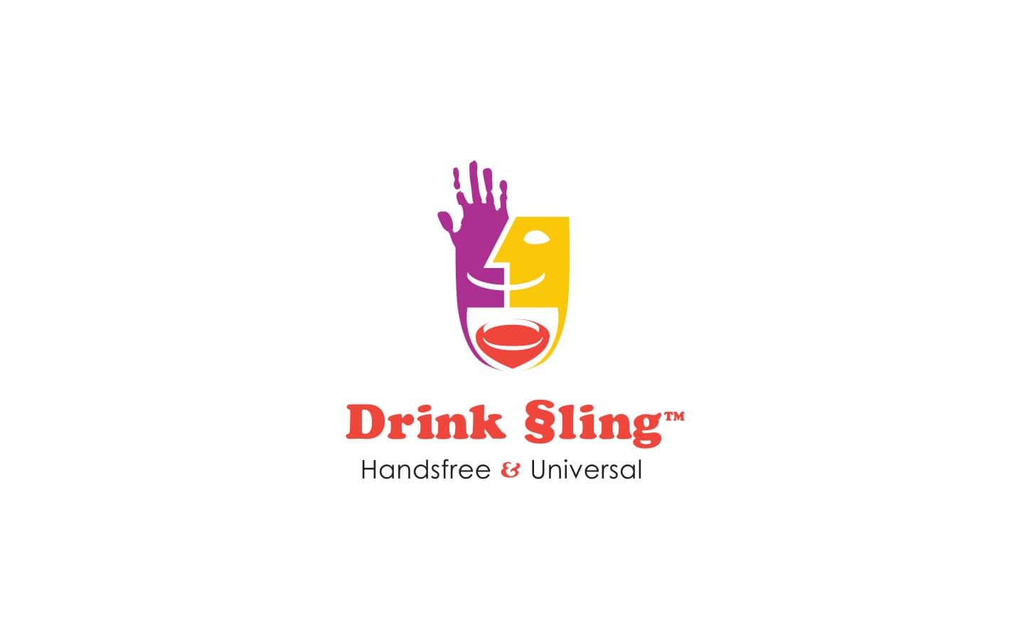
When it came time to design a logo for a hydration company focused on mobility, we were enthusiastic to do something that blended divergent and opposed themes: old/new, formal/informal, and niche/pop. Ideas began generating soon thereafter. Below you’ll see some earlier concepts that were used to inform the final design and its characteristics. The final design was greatly influenced by pop art, with a bright assertive color palette. Yet, it also found cues from fine art and cubism. More subtly, the overall form of the logo was influenced by the function of the product. Overall this was a very successful project and the business was delighted to have such a unique representation for their product’s brand.
