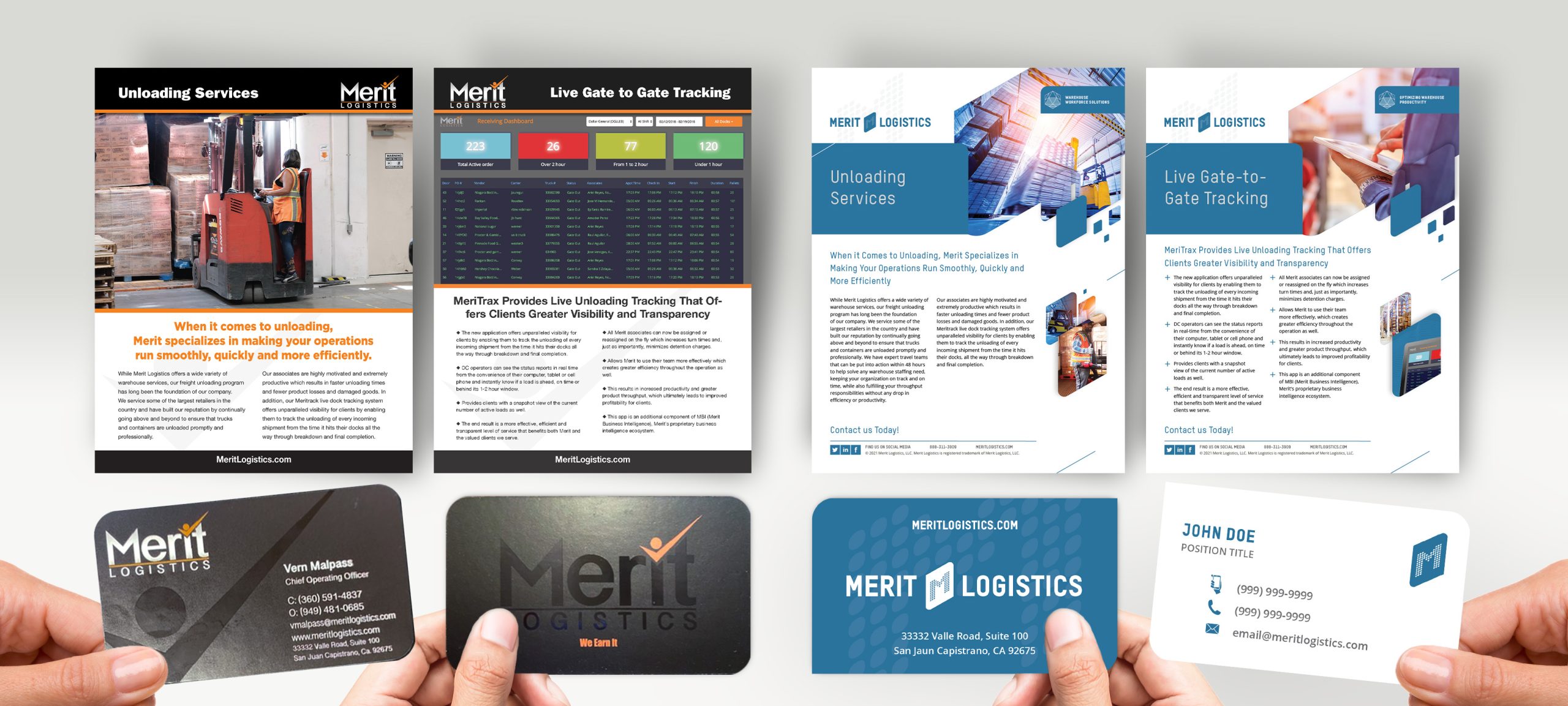
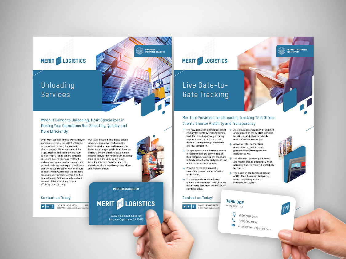
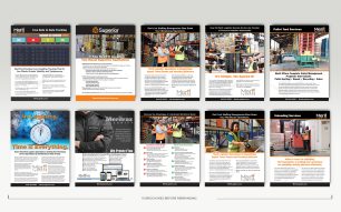
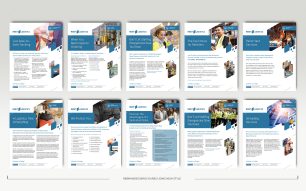
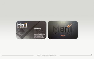
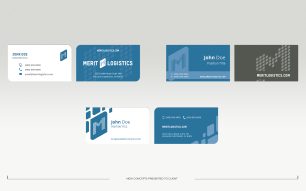
For this project, the company recently finished a rebrand and was in need of redesign work on multiple pieces of collateral. There were approximately 10 brochures and a high-level business card that required updating to the new style. The previous style featured lots of black and was very dark in general. The new style was much brighter. The logo was redesigned (by another vendor) using lots of blue, and from a guideline standpoint, the initiative was to produce something with more white, open space. The design predicate was a predesigned (by another vendor) print ad that was to be running concurrently with the new materials and should therefore live in harmony with the design direction. The brochures were broken into four distinct milestones, i.e., template concepts, selection, template cascading, and final delivery. The business cards required only three distinct concepts and sparse edits with three milestones, i.e., concepts, selection, and final delivery.
The business cards were designed to include spot channels for printing raised spot UV for texture, and a die-line for rounding particular edges of the business card to resemble the logo tile. It is impossible to illustrate the raised spot UV in the images found here, but when printed this subtlety presents a polished impact.
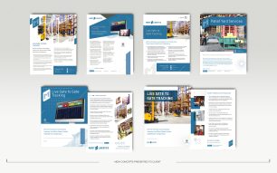
The brochures were originally conceived as front and back sales and marketing one-pagers, but after feedback from the client, they were modified to front-side-only brochures. The concepts were designed to be disparate from each other, unique in their own way while also still abiding by the rules of the new guidelines and design aesthetics. New recommendations for stock photography, copywriting, and custom graphics were presented in each layout while cascading the template. For that extra touch, elements of the logo were pulled out as supporting graphics where possible.
In the end, the client remarked, “Our CEO liked all the designs,” and during the process even mentioned, “These are all looking great.” You can also see their review here on our site.
