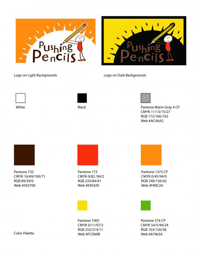
It is a rewarding experience to brand a nonprofit that works to deliver educational support materials to developing countries in the world. Especially, when the project is being influenced by a young middle-schooler. How? Well, in efforts to teach their child some business skills, the client requested that their son give shared design input. This seemed like a great idea as he shared many traits of the primary audience. The desire of the project was to create a logo that featured child-like lettering, hand-drawn elements, symbols of love/warmth/care/children, and of course… pencils. There was also a push to create a logo that also spoke to the donors, something that spoke about the nature of helping others and the value of educational success. It should ultimately be a logo that inspires hope.
The logo concepts held many ornaments of implied meaning based on the direction of the project.
- The typography featured a floating baseline and youthful theme, while an opposite was provided to better guage the client’s preferences.
- The use of symbols such as hearts, stars, sun, and backpacks inspire care, success, warmth and education.
- Hand drawn shape fills further emphasized scholastic pursuits.
- The color palette was primarily something that felt thematically African like those you’d see on a sunset on the safari, with pastels as a secondary option.
After a couple design revision meetings, the final logo took shape. The initial direction was different enough to filter just what they were looking for and the next iterations were a hit, and after one final color revision, the logo was complete. Job well done to the client and their son!
