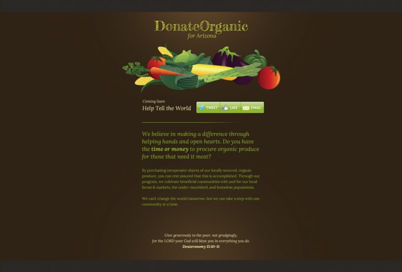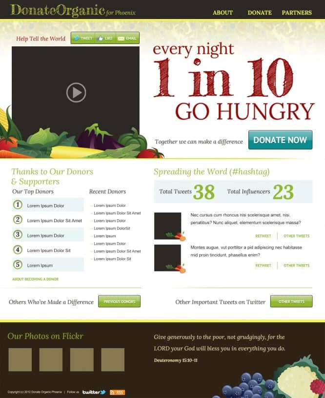
Donate Organic was in need of a basic web design. The immediate need was for a splash page to go up that would serve as an introduction to their non-profit. They were looking for a design that connected their strong messaging to their audience and looked unafraid to drive an emotive response. In this case, the messaging was promoted above the fold and very large and the rest of the home page was designed to spread social awareness. In the end, the design is trimmed of any “fat.”


